All items about data

Posts

Human 2.0 Holiday Highlights

What better way to ring in the New Year than to put your feet up and enjoy a few re-runs? Here are some of our most popular posts from the last year or so as well as a few you might have missed…

1. Posthumanity and digital superpowers

From http://www.flickr.com/photos/jdm1979uk/3607288494

We’ve been blogging about Human 2.0 for over two years now, but it was this April that we split off from Bitcurrent and launched this site. We kicked off with two launch posts… a high-level scene-setter called Welcome to posthumanity:

“We’re becoming a new species–one that can hack its own cognition and edit its own biology. We’re all getting an upgrade, like it or not. This is the most important subject of the century, but it’s still hiding in academia and science fiction. We hope to change that.”

Ten superpowers the Internet gave us

…and a look at some of the tangible ways in which the Internet gives us superpowers:

We may not realize it, but the Internet has given us superhuman abilities. Technology lets us to do things that were impossible 30 years ago – from speaking foreign languages and armchair travel to global messaging and virtual worlds. Welcome, Human 2.0, these are your superpowers.

2. It’s all about the data

Read more »

Links

File-sharing in the great outdoors

A "Dead Drop" in New York City

Inspired by geocaching and a desire to get technology out into the physical world, media artist Aram Bartholl has spawned a new Internet phenomenon. “Dead drops” are USB sticks cemented into walls of public buildings, with their locations plotted online at deaddrops.com, the site which invites you to “un-cloud your files in cement”. Together the drops form “an anonymous, offline, peer to peer file-sharing network in public space”.

The idea is that anyone can upload or download files by plugging their laptop into the wall. The project has sparked a great deal of controversy with some describing the drops as “electronic glory holes”, but as Bartholl says “It’s very much about the thrill and the idea of what could be on there.”

Read an interview with Aram Bartholl at .net.

Posts
Video
Featured

Understanding human behaviour is vital for good product design. But you can’t just ask people what they need, you have to observe them first-hand. iPods, eBay and TiVo exist because designers watched people, noticed a problem with current products, and designed a solution for a problem people didn’t even know they had.

At OXO Foods in the UK, researchers studied how people measure liquids while cooking, and noticed that most people need to bend down repeatedly to read the markings on the side of the container. None of them reported this as a problem when interviewed. So OXO designed a measuring jug(cup) which could be viewed from above (shown right). This is an example of the growing science of design ethnography – product design based on direct human observation.

How to measure human behaviour “in the wild”?

Observational studies are expensive to conduct, and sometimes distorted because you can’t always observe someone in their natural environment. Fortunately, computers now make it much easier to collect data from “real world” activities. Such data is invaluable – for product designers to better understand their users, and also for us to help us cultivate a deeper understanding of ourselves. Read more »

Posts

Pulling SMS data from used phonesAt the HCI 2010 conference in Dundee, Scotland, researchers from Glasgow University announced preliminary results that show that a high number of re-sold mobile phones contain personal information left by previous owners. In some cases the data was highly sensitive or incriminating – and in some cases was believed deleted, but still recoverable. Read more »

Links

Physically visualizing your data

petitinvention

Today, we digitize everything, be it software, documents, music, art or movies. To the computer, it’s all bits (1’s and 0’s) but to us, not all bits are created equal.

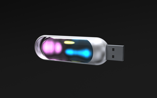
Here’s a design concept for a USB stick that borrows a concept from drive-space software like WinDirStat or Disk Inventory X, and  shows how much data is stored, and what type it is, by illuminating lights of different colours – maybe pink for music, blue for data, green for images. Which could be pretty handy. More info here.

plusminus

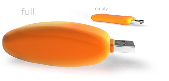
Here’s another idea in a similar vein – The flashbag inflates to increase its size when it’s full, and deflates when it’s empty – a visual reminder to clear those files off.

Are we seeing the tip of the iceberg for a new way of thinking about our digital possessions?

Posts

You’ve seen bad metaphors for the Internet. Pop culture is filled with films where special effects show computer networks as highways, with towering servers encroaching on light-filled roads. These scenes try to represent the Internet as, well, a series of tubes (Play this clip from Hackers to jog your memory.)*

This happens a lot in Hollywood, and in too many cyberpunk novels (like one I’m finishing now just to spite myself.) I forgive William Gibson’s “collective hallucination” and Neil Stephenson’s Metaverse because, well, they’re good books.

But maybe the UI of the future will look like this after all, at least for certain applications. Check out Britain from Above by way of the folks at Flowing Data. Warning: clicking this video may make your browser lock up for a minute for some reason. Be patient, or go to the Youtube playlist.

There are clips for telecommunications, air traffic, and even shipping on the site itself, which is well worth the visit.

I’m a huge believer in visualizing information and making the world more understandable, and the convergence of things like geomapping and GPS are making understanding even easier. These clips resemble nothing if not an RTS for the real world. It makes me want to click and drag routes for cars and boats.

I used to think Tron was a great movie, but not really a UI. Now I’m starting to wonder how these flying-through-data approaches, first conceived as a network metaphor for the non nerd, can become user interfaces.

This is how the prescient visuals of Minority Report slowly become reality.

We’re about to drink from a firehose of positional data as location-aware personal devices replace traditional cellphones and we move towards a sensor-driven world. We have the cloud computing infrastructure to handle massive computing and fast data retrieval. How long until Britain From Above becomes a live Google Earth overlay?

Oh, wait. It already is. Here’s the site’s Google Earth layer. When will web analytics catch up with this?

(*For real fun, check out the eighties-era Mac copy dialog at 8:18 in that Hackers clip. Anachronisms, FTW!)

Powered by WordPress, based on Mina theme.