All items about Visualization

Posts
Video
Featured

Understanding human behaviour is vital for good product design. But you can’t just ask people what they need, you have to observe them first-hand. iPods, eBay and TiVo exist because designers watched people, noticed a problem with current products, and designed a solution for a problem people didn’t even know they had.

At OXO Foods in the UK, researchers studied how people measure liquids while cooking, and noticed that most people need to bend down repeatedly to read the markings on the side of the container. None of them reported this as a problem when interviewed. So OXO designed a measuring jug(cup) which could be viewed from above (shown right). This is an example of the growing science of design ethnography – product design based on direct human observation.

How to measure human behaviour “in the wild”?

Observational studies are expensive to conduct, and sometimes distorted because you can’t always observe someone in their natural environment. Fortunately, computers now make it much easier to collect data from “real world” activities. Such data is invaluable – for product designers to better understand their users, and also for us to help us cultivate a deeper understanding of ourselves. Read more »

Links
Video

Visualizing social data

The folks at Contagious Magazine have an interesting piece on visualizing check-in data. Weeplaces.com lets you visualize your check-in data across several services, including Foursquare and Facebook Places. I generated mine fairly easily.

FourSquare Visualization by WeePlaces.com from Eric Wu on Vimeo.

This reminds me of nothing as much as Plazes, an early check-in competitor (that relied on MAC addresses to “claim” locations — this was pre-iPhone, of course.) Plazes caught on a bit, and was eventually bought by Nokia, but lacked the critical mass needed for applications like Foursquare, Groupon, and Gowalla.

Links
Video

It’s one of the great philosophical debates of all time. Given enough computing horsepower, would we know the difference between the real world and a simulated one? With the cost of bandwidth, computing, and storage dropping precipitously, it’s harder and harder to tell the real from the simulated.

Check out the Lagoa Multiphysics plugin for Softimage. It’s pretty impressive. Tools like this do for interactive visualization what still-image tools like Photofuse do for traditional photographs.

You might argue that to really trick us into believing the world around us was a simulation, each particle the software represented could only consume one particle of computing infrastructure. But isn’t that what the universe looks like? And did I just blow your mind?

Links

Visualizing big data

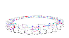
Making sense of the huge reams of data around us isn’t easy. Sometimes it takes new visualizations and dimensions, like the ones in this photo set on Flickr, prepared as part of Wired UK‘s latest issue. The image at right shows how we can track human mobility from cellphone data.

As we drink from the firehose, we’ll get informational obesity — there’s a reason they call it a feed. New interfaces — from the immersive to the augmented — will be key to coping with it. This set has some tantalizing suggestions of what that might look like.

Links
Video

Visualization at two extremes

I’ve been spending a lot of time on interfaces and visualization lately, as part of a new conference that melds Big Data, Ubiquitous Computing, and New Interfaces. Along the way, I was struck by these two extremes of visualization.

At one extreme, there’s the Canadian filmmaker who’s implanted a camera in his eye socket. It’s a great example of embedded, ubiquitous data collection — something we’ll likely all take for granted very soon. This is visualization in the truest sense.

At the other end of the spectrum is the Allosphere, an immersive, three-storey-tall sphere used for visualizing and interacting with data.

These two spheres are very different. One collects a single person’s perspective; the other reveals huge amounts of data. One shows things at an intimate, human scale; the other zooms out to galazies or in to neurons.

Links

Physically visualizing your data

petitinvention

Today, we digitize everything, be it software, documents, music, art or movies. To the computer, it’s all bits (1’s and 0’s) but to us, not all bits are created equal.

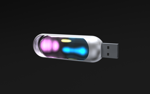
Here’s a design concept for a USB stick that borrows a concept from drive-space software like WinDirStat or Disk Inventory X, and  shows how much data is stored, and what type it is, by illuminating lights of different colours – maybe pink for music, blue for data, green for images. Which could be pretty handy. More info here.

plusminus

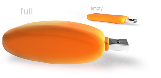
Here’s another idea in a similar vein – The flashbag inflates to increase its size when it’s full, and deflates when it’s empty – a visual reminder to clear those files off.

Are we seeing the tip of the iceberg for a new way of thinking about our digital possessions?

Links

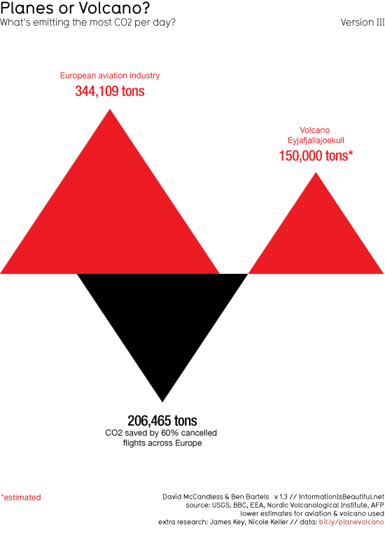
Which emits more CO2 - the Icelandic Volcano or the planes it stopped from flying?As more and more data is scrutinized in public, there is a growing trend towards creating visualizations that are easier to digest than the raw numbers.

Here’s a topical infographic pulling together the effects of mankind and Mother Nature on our atmosphere. You can see that the Icelandic volcano eruption’s effects are cancelled out by the planes that have been grounded because of the ash cloud, and in fact we are witnessing a net reduction in CO2 pollution this week. More details here.

Posts

You’ve seen bad metaphors for the Internet. Pop culture is filled with films where special effects show computer networks as highways, with towering servers encroaching on light-filled roads. These scenes try to represent the Internet as, well, a series of tubes (Play this clip from Hackers to jog your memory.)*

This happens a lot in Hollywood, and in too many cyberpunk novels (like one I’m finishing now just to spite myself.) I forgive William Gibson’s “collective hallucination” and Neil Stephenson’s Metaverse because, well, they’re good books.

But maybe the UI of the future will look like this after all, at least for certain applications. Check out Britain from Above by way of the folks at Flowing Data. Warning: clicking this video may make your browser lock up for a minute for some reason. Be patient, or go to the Youtube playlist.

There are clips for telecommunications, air traffic, and even shipping on the site itself, which is well worth the visit.

I’m a huge believer in visualizing information and making the world more understandable, and the convergence of things like geomapping and GPS are making understanding even easier. These clips resemble nothing if not an RTS for the real world. It makes me want to click and drag routes for cars and boats.

I used to think Tron was a great movie, but not really a UI. Now I’m starting to wonder how these flying-through-data approaches, first conceived as a network metaphor for the non nerd, can become user interfaces.

This is how the prescient visuals of Minority Report slowly become reality.

We’re about to drink from a firehose of positional data as location-aware personal devices replace traditional cellphones and we move towards a sensor-driven world. We have the cloud computing infrastructure to handle massive computing and fast data retrieval. How long until Britain From Above becomes a live Google Earth overlay?

Oh, wait. It already is. Here’s the site’s Google Earth layer. When will web analytics catch up with this?

(*For real fun, check out the eighties-era Mac copy dialog at 8:18 in that Hackers clip. Anachronisms, FTW!)

Powered by WordPress, based on Mina theme.