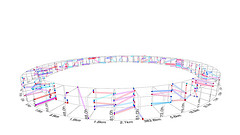
 Making sense of the huge reams of data around us isn’t easy. Sometimes it takes new visualizations and dimensions, like the ones in this photo set on Flickr, prepared as part of Wired UK‘s latest issue. The image at right shows how we can track human mobility from cellphone data.
As we drink from the firehose, we’ll get informational obesity — there’s a reason they call it a feed. New interfaces — from the immersive to the augmented — will be key to coping with it. This set has some tantalizing suggestions of what that might look like.


 @
@ Tags:
Tags: 


 Like all images on the site, the topic icons are based on images used under Creative Commons or in the public domain. Originals can be found from the following links. Thanks to